Ling Chun Apostrophe S
Galleries are slowly reopening. Method Gallery has a wonderful new installation by Ling Chun. When I first saw it, I was confounded.
Ling is a ceramic artist in her training, but what she does with ceramics is so innovative, that she must now be called a multimedia artist at the intersection of pop, modernism, and contemporary politics.
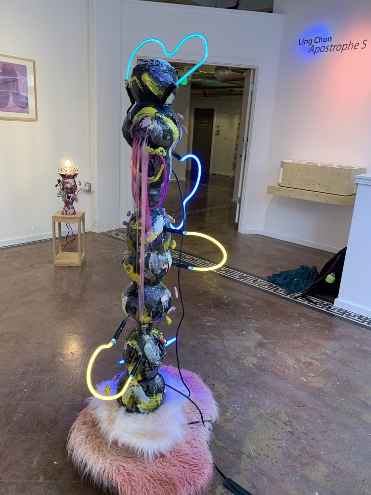
As I looked at this complicated work, with the title, The Neon She Remembered ( 2020), I first had to set aside my own preconceived aesthetic ideas. In her combination of fake pink fur, neon, ceramic purposefully declaring its own glazes ( more on that), Ling comes from an entirely new aesthetic generation. But each element of her work is layered with meaning.
Originally from Hong Kong ( she came here at age 17), Ling learned Chinese calligraphy as a child. She spoke of learning chinese characters, practicing a single stroke all day, to create harmony between one stroke and the next of a single character.
For her ceramics are a symbol of language, that is why you see curved shapes flying off her central form. These are individual strokes of Chinese Calligraphy.

Lets go back to The Neon She Remembered. The neon is itself a complex medium, now archaic, as she has pointed out, with the emergence of LED lights. For her it is deeply associated with Hong Kong as she remembers it from her youth, filled at night with neon street signs. She took a workshop in order to understand how to create neon. Here it seems to wander outside the main structure, creating visual connections between the separate segments. The colors connect to the Hong Kong democracy movement, yellow pro democracy, blue pro government.
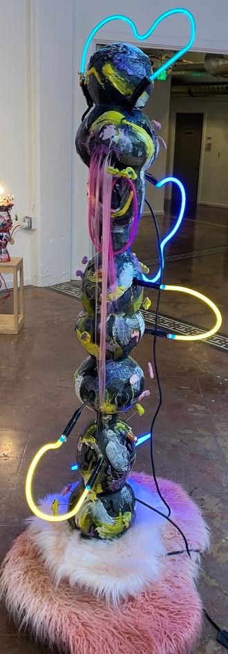
That pink and white fur as a base represents perhaps the soft foundation of the current world, Hong Kong, our lives, maybe it is simply a cushion for the piece, giving it an unreliable place to stand. I associate it with the Asian girl fashion that we heard so much about a few years ago ( as in Hello Kitty of course).
Then there is the magenta hair. Ling went to beauty school at some point, but quit, yet she has a life-long love of hair, and here we see it hanging down straight on this female figure.
Is this a self portrait actually, caught between the different forces of the world?
Ling speaks of yearning for home without having a sense of belonging either here or in Hong Kong. She is caught in between, a feeling of so many immigrants. Here she gives us fragments of memories, of who she is, of who she remembers being, of perhaps who she is becoming.
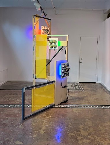
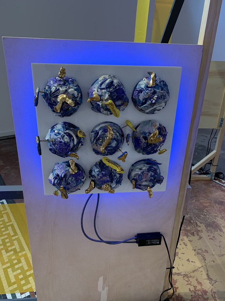
The second large piece in the exhibition Sign/Sigh is an installation. Again blue and yellow are the dominant colors, here on a plywood construction that echoes classical modernism. But plywood as a material is suddenly so prominent in the windows of closed stores everywhere.
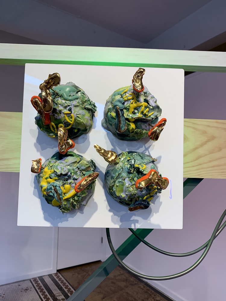
The sculptural elements of the squares with balls in a grid refer to Chinese characters. The balls are “signs” ( in both a literal and metaphorical sense of the word) of calligraphy. Chinese square calligraphy is a simplified version of writing in Chinese characters.
Ling stated that the works evoke belonging and memories of home. But they are also expressing our current disrupted world in which all the familiar structures and habits are altered, suspended, cancelled, coming apart, disappearing, or destroyed.

Returning to the ceramic itself, an ancient medium, a modern medium, a medium that can rise up in rebellion, or subside into quiet utility. Here it rises up, literally off the surface. The glazes are individual sculptural elements, they refuse to blend, lie on the surface or subside. They are a churning sea of color and form.
When asked who inspired her, one of the artists that she mentioned was Ron Nagle. Nagle is an old friend of mine from the three years that I taught with him at Mills College. On first glance his meticulous ceramics seem far from Ling’s work, she seems closer to the work of Peter Voulkos, the ceramic artist who broke through the prejudice against ceramics to achieve international acclaim during the era of Abstract Expressionism. Nagle is entirely different, his work is small in scale, but his glazed colors and shapes are layered, surprising and completely unpredictable. As a personality, he is outrageous, and funny. He is also a musician. So he mixes it up too.
Here is Light Me Up Green: pop color and offbeat juxtapositions are crucial in all of her works, and the same is true of Nagel’s work. The surfaces are entirely different, but the juxtapositions of unexpected hues is similar.
The entire exhibition called “Apostrophe S” ( what does the title signify? belonging, not belonging?) is initially alienating then provocative because it provides insights into Ling and her life experience, as well as a window into the chaos of this turbulent moment.
.
This entry was posted on July 26, 2020 and is filed under Uncategorized.